Product Design - 2026
AI · Neuroscience · Mobile App
Calibrate — Learn what you can actually explain.
A learning app that turns students’ own course material into active smart recall sessions, then uses every answer to understand what they actually know.
Rereading, summaries and multiple-choice questions can make information feel familiar without proving it can be recalled.
Calibrate asks a harder question: can you explain it without support?
I studied research in cognitive psychology and neuroscience to understand how memory, retrieval, self-explanation and confidence affect learning.
Those findings became product rules — shaping how Calibrate asks questions, reveals answers, evaluates understanding and decides what should be reviewed next.
Your courses, organised and ready to practise.
Import PDFs, photos, notes or text. Calibrate identifies the important concepts, turns them into question cards and organises each course for you.
AI-generated categories make sets easy to filter, while mastery shows where you currently stand.

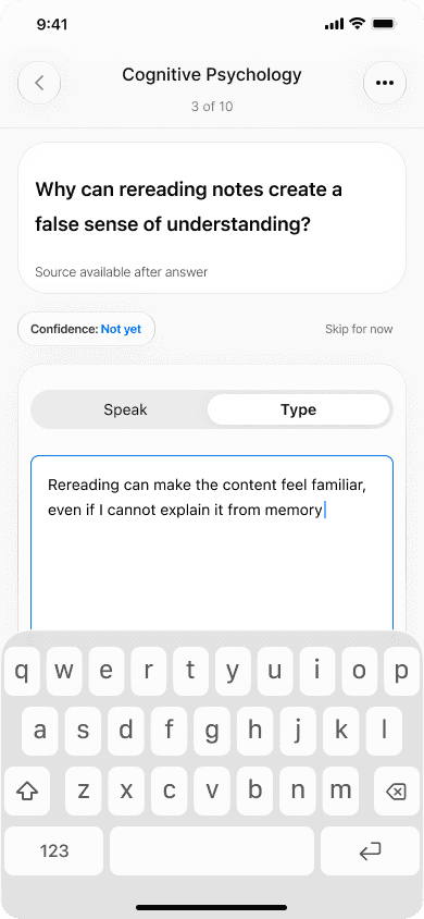

One loop drives the entire experience.
Choose a card. Predict how confident you feel. Explain the answer from memory by speaking or typing. Then compare what you produced with what the course actually contains.
The answer stays hidden until the learner commits.
No multiple choice, no early hints and no answer to recognise.
The learner first has to retrieve the idea through a written or spoken explanation — only then can Calibrate reveal and evaluate it.
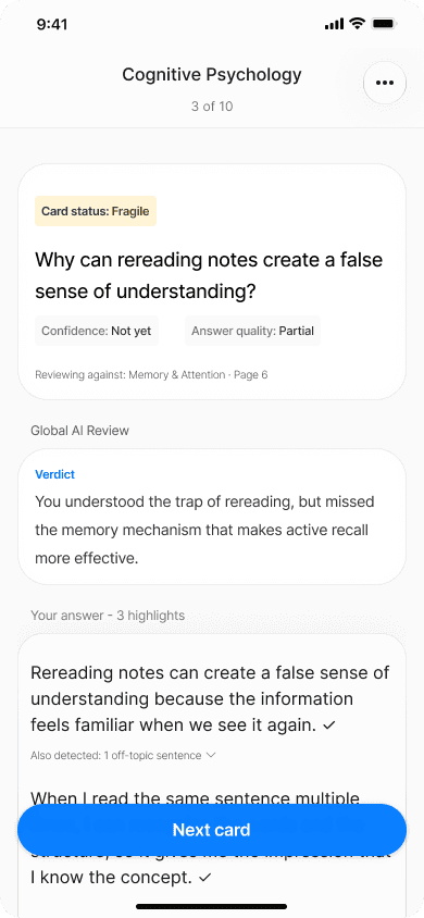
Every answer becomes a diagnosis, not just a score.
Calibrate compares the response with the original course, highlights what was correct, missing or too vague, and shows how the explanation could be improved.
Confidence and answer quality give each card a learning state —
from a blind spot or fragile understanding to something genuinely mastered.
Feedback only matters if it changes what happens next.
Each answer updates the card’s learning state, helping Calibrate identify what deserves attention next.
Learners can practise a single card or launch a Smart Review Session, focus only on weak spots, review the full set or customise the session around what they need.
Calibrate connects personal course material, active retrieval, source-grounded AI feedback and adaptive review into one learning loop. You study your own course, practise it through questions and explanations, and every answer helps decide what should be reviewed next.
You study your own course ↔ You use the app to practice it
Designed as a product, not just a learning-science concept.
As a UX/UI Designer, cognitive science was only one part of the process. I worked across the product from user research and journey mapping to product architecture, AI behaviour, UX flows, interface design and the design system.
I then built a high-fidelity prototype to test the experience with users, identify what did not work and iterate on the product.
* The AI experience was also designed with realistic implementation in mind, with its feasibility reviewed alongside an AI engineer.

UX / UI Design - 2025
Research · Marketplace · Mobile & Web
2ememain — Making second-hand shopping easier to find, trust and act on.
A concept redesign of Belgium’s C2C marketplace, focused on reducing friction between discovering an item and feeling confident enough to contact the seller.
Second-hand shopping is becoming increasingly popular, with more people turning to pre-owned products to keep spending under control — especially during high-expense periods like the holiday season.
Yet, while the market continues to grow, 2ememain has been losing users.
That gap is where I stepped in.
I started with the journey, not the interface.
I combined a UX/UI audit, user research, user interviews, competitor analysis and journey mapping to understand where people were losing clarity or confidence.
Across different buyer and seller scenarios, three frictions kept appearing:
Search effort. Trust signals. Messaging uncertainty.
That gave the project a clear direction: improve the decisions users make along the journey, rather than simply modernising the interface.
I mapped the core journey from discovery to seller contact, then broke it down into the decisions users actually need to make:
What am I looking for? → Is this listing relevant? → Can I trust it? → Do I want to contact the seller?
I explored those decisions through user flows and low-fidelity wireframes before moving into visual design.
This helped me focus on structure first: clearer search guidance, faster comparison and stronger continuity between browsing, listings and messaging.
I tested the logic before polishing the UI.
Early scenario-based testing showed that users still needed support at three specific moments.
Search needed to provide more direction.
Product cards needed to make comparison faster.
The home page needed to surface a better-curated selection of listings, with clearer hierarchy, to support faster decisions.
And users wanted more reassurance before starting a conversation with a seller.
Those findings became concrete design changes rather than another research deliverable.
Search that guides without taking control.
I redesigned search around recent searches, contextual suggestions, categories and more relevant filters.
Instead of forcing users to know exactly what to type, the interface helps them progressively narrow their intent while still leaving room to explore.
The goal was not to automate the decision — it was to make reaching it require less effort.
The right information appears before the decision.
Product cards were redesigned to surface the information people use to compare listings — price, condition, distance, delivery options and seller signals — before requiring them to open every item.
Trust was treated the same way.
Rather than relying on one reassurance feature, the experience builds confidence through a series of smaller signals across the listing, seller and communication flow.
High fidelity was not the finish line.
I tested targeted mobile and web prototypes through 5 moderated guerrilla tests and 10 remote Maze tests.
The tests led to small but meaningful iterations: contextual categories became more visible, assisted search patterns were reinforced, and the “daily deal” concept worked better when integrated naturally into the feed.
The final interface was therefore shaped by both the original research and what happened when people actually used it.
Modernising without losing familiarity.
2ememain is already a familiar marketplace, so the redesign was never about making the product feel completely different.
I kept the patterns users already understood, while reworking visual hierarchy, content density and information priority to make the experience easier to scan and more comfortable to use.
Outcome
Because this was a concept redesign rather than a shipped product, I focused on observed usability improvements instead of invented business metrics.
Testing showed a clearer understanding of the redesigned journey, particularly around search, listing comparison and the information users looked for before contacting a seller.
The main lesson was that marketplace trust is cumulative.
It does not come from one badge or rating.
It comes from the quality of the listing, the seller information, the photos, the condition, the distance, the way information is structured and the continuity of the conversation.
Improving the experience meant designing those signals as one system.
Next step: validate the high-fidelity prototype with a larger group of buyers and sellers, measuring task completion, search efficiency, perceived trust and intent to contact.


Jean-Baptiste Moriconi
UX UI Designer
I turn complex products into clear, usable experiences connecting research, product logic and visual craft to make the right next step feel obvious.