

A focused empty state avoids a blank dashboard and guides the learner toward the first useful action.
The project itself :
Project Overview
My role:
Product Designer role
UX Design
UI Design
Audit
Benchmark
User flows
Prototyping
Design System
Testing
2ememain is a well-established Belgian C2C marketplace.
This concept redesign explores how to make the resale journey easier to browse, easier to trust, and smoother to complete.
General problem:
The platform works, but the resale journey still requires too much effort before users feel confident enough to act.
Search:
Searching required too much effort: there was little guidance, unclear hierarchy, and filters were not always intuitive.
Messaging:
Communication remained fragile: slow exchanges, conversations that went nowhere, and a lack of continuity between search and messaging.
Trust:
Listings lacked reassuring signals: inconsistent quality, incomplete information, and sellers who were difficult to assess.
All about the user :
Research & discovery
To understand where the resale journey was breaking down, I combined UX/UI audit, user interviews, benchmark analysis and journey mapping.
The research focused on three recurring frictions: finding the right item, trusting the listing or seller, and turning interest into a successful conversation.
Pain Points
Search effort
Users had to work too hard to find relevant items, with limited assistance, weak hierarchy and filters that were not always intuitive.
Trust signals
Listings often lacked reassuring information, making it harder to assess item quality, seller reliability and overall credibility.
Messaging friction
Conversations could feel slow or uncertain, creating a weak transition between discovery, decision and buyer–seller exchange.
User Personas
I mapped different buyer and seller profiles to understand how trust, search habits and communication needs vary across the platform.



User Journey Map
Mapping the resale journey helped identify where users lose clarity, confidence or momentum.
6 scenarios were tested across different buyer and seller profiles.
Goal
Help users find a relevant item, assess whether it feels trustworthy, and contact the seller with less uncertainty.

From research to structure :
Starting the Design
After identifying the main frictions in the resale journey, I translated the findings into user flows, information architecture and low-fidelity wireframes.
The goal was to clarify how users search, compare, evaluate trust and move into a conversation with the seller.
User flows
I mapped the key paths users take when searching, comparing listings and contacting a seller.
The flows helped me identify where the experience needed more guidance, clearer decision points and better continuity between search results, listing details and messaging.

Main buyer flow — from search intent to seller contact.
Competitor analysis
I analyzed how other C2C and resale platforms structure search, product cards, trust signals and buyer–seller interactions.
The goal was not to copy existing patterns, but to identify what users already expect from marketplace experiences — and where 2ememain could feel clearer, safer and more efficient.

Low-fidelity wireframes
I translated the research and benchmark findings into early layout explorations.
The wireframes focused on guided search, more scannable listing cards, stronger trust signals and smoother access to messaging.

First usability Testing
I tested the prototype to understand how users searched, compared listings and decided whether to contact a seller.
I ran scenario-based usability tests around the key resale journey: finding a relevant item, evaluating listing trust and moving into a conversation with the seller.
The goal was to identify where users still hesitated, felt overloaded or needed clearer signals before taking action.
Search guidance:
Users expected the search to help them faster, especially through suggestions, recent searches and filters adapted to the item category.
Listing comparison:
Users needed to compare listings quickly, but key information such as condition, distance, price and seller credibility had to be more visible.
Trust before contact:
Before messaging a seller, users looked for reassurance: complete photos, clear item details, seller signals and a sense that the listing was reliable.
From structure to interface :
Refining Design
After defining the flows and key frictions, I moved into high-fidelity screens and an interactive prototype.
The focus was not only visual polish: each interface decision addressed one of the main issues identified earlier — search effort, trust assessment and buyer–seller communication.
Design Decisions
Before moving into the final interface, I focused on a few key design decisions that directly answered the main frictions identified earlier: search effort, trust assessment and buyer–seller communication.
Listing cards
I redesigned the product cards to make key information visible before opening the listing: price, condition, distance, delivery option and seller rating.
🔁 Research, test, redesign.
The goal was to improve scannability and help users compare items faster without adding unnecessary visual noise.

Assisted search
I made the search experience more guided through recent searches, category suggestions, related terms and contextual filters.
The goal was to reduce search effort while keeping users in control of their exploration.

Dynamic home
I designed a more personalized home experience mixing recommendations, seasonal moments and a “daily deal” pattern.
The goal was to make browsing feel more useful, more contextual and more likely to bring users back.

Test & Iteration
Test setup:
5 moderated guerrilla tests on mobile
10 remote tests via Maze across web and mobile
Participants included both buyer and seller profiles
I tested targeted prototypes across mobile and web to understand how users reacted to the new search, home, card and messaging patterns.
The goal was to validate whether the redesign improved clarity, confidence and orientation before moving into the final screens.
Task 01 — Open-ended discovery
Scenario
“You just opened 2ememain and don’t have a specific item in mind. What do you do?”
Insight
Users understood the home quickly and perceived it as a familiar mix of discovery patterns.
Iteration
The “daily deal” card worked better when placed inside the feed rather than above the product items.
Task 02 — Find a nearby item
Scenario
“Find a bike close to you.”
Insight
Users naturally targeted the search bar and quickly understood the difference between recent and popular searches.
Iteration
The assisted search pattern reduced friction and made the search journey feel more direct.
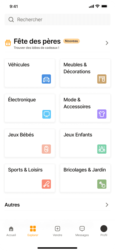
Task 03 — Find a gift idea
Scenario
“You want to find a gift idea for someone. How would you do it?”
Insight
Most users started from the home, then moved toward categories when they needed more structure.
Iteration
Category cards and contextual blocks were made more visible to support both exploration and directed search.


High-fidelity screens
The final screens translate the research findings into a clearer, more structured marketplace experience.
I refined the interface around clearer product cards, guided search patterns, stronger trust signals and smoother access to messaging.
The goal was to make browsing easier, comparison faster, and the transition from interest to contact more reassuring.



Prototype outcome :
Outcome
This concept redesign was tested as a prototype, so the outcome focuses on observed usability improvements, user perception and design learnings rather than production metrics.
The final direction clarified the resale journey around three key moments: finding relevant items, evaluating trust, and moving into a conversation with the seller.
Takeways
What the project revealed about search, trust and communication in second-hand marketplaces.
Impact:
Users understood the redesigned journey more easily and felt better guided when searching, comparing listings and deciding whether to contact a seller.
The strongest improvements came from clearer product cards, assisted search patterns and more visible trust signals before messaging.
What I learned:
Trust in a C2C marketplace is not created by one single element. It comes from many small signals: listing quality, seller cues, item condition, distance, photos and communication flow.
I also learned that improving search is not only about filters. It is about helping users make faster decisions without taking control away from them.
Next Steps
What I would explore next to push the concept further.
Run a larger usability test on the high-fidelity prototype with more buyer and seller profiles.
Measure task completion, perceived trust and contact intent to validate whether the redesign improves the resale journey.